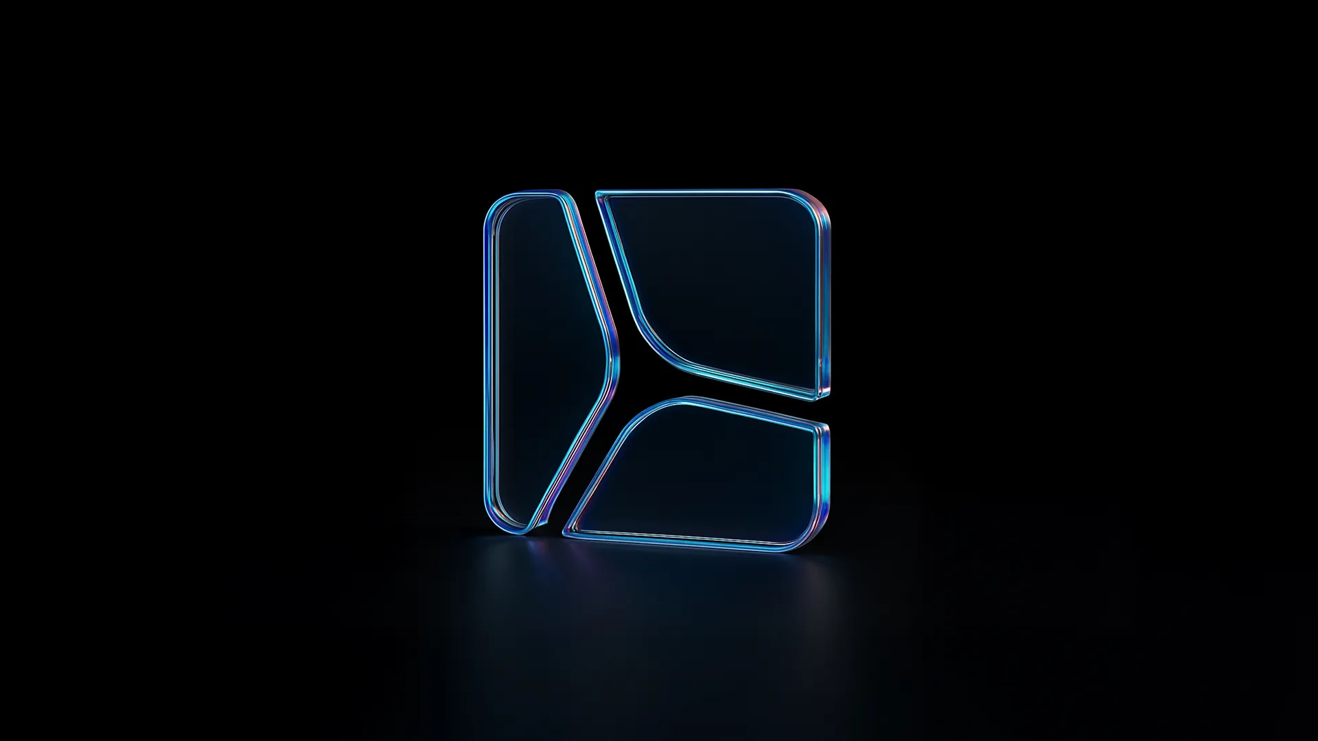
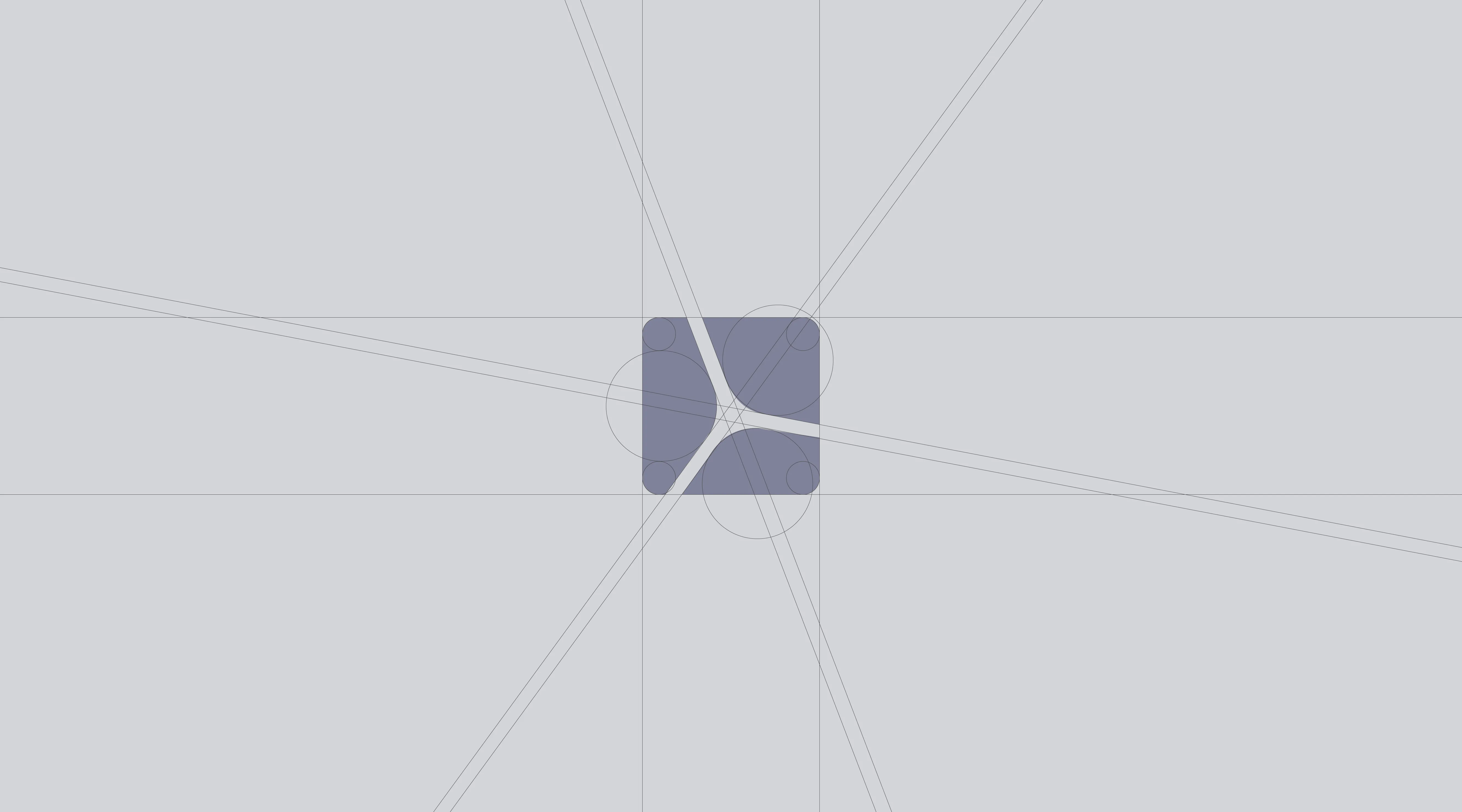
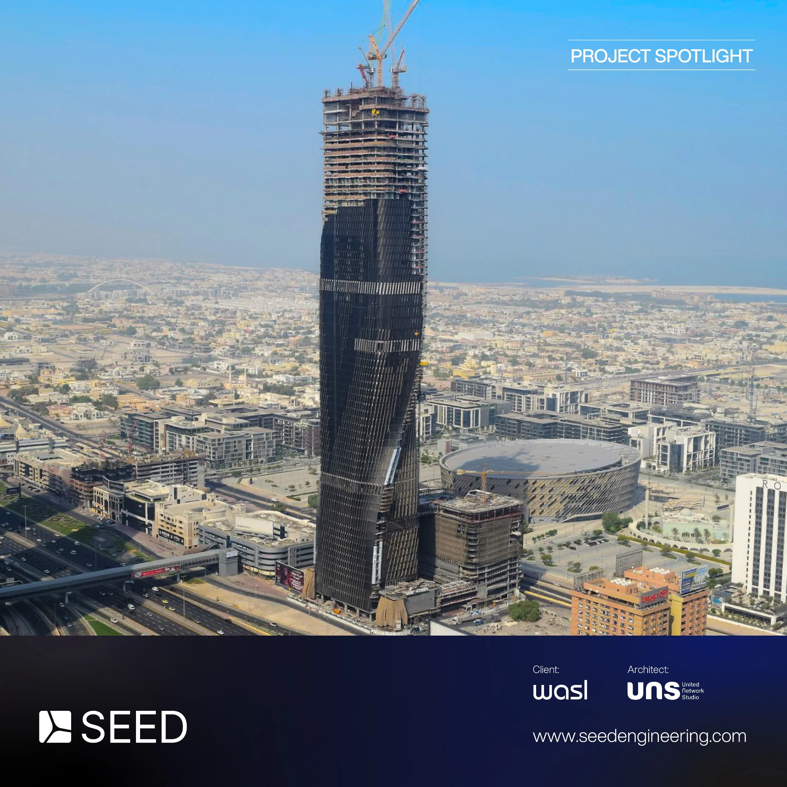
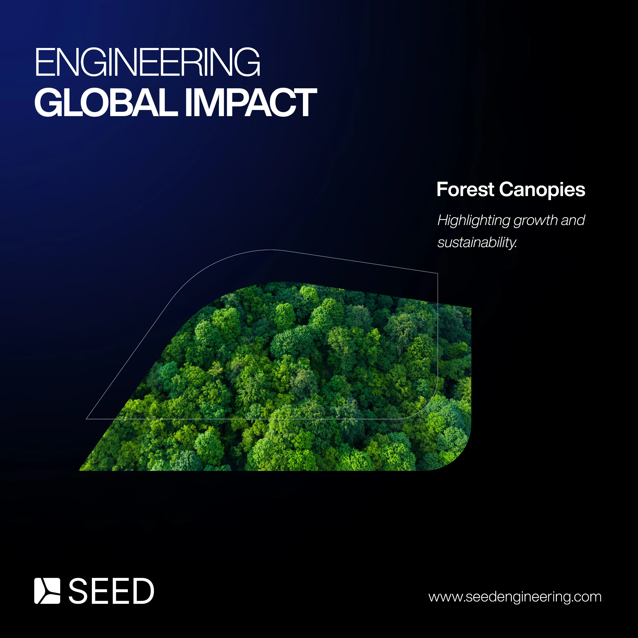
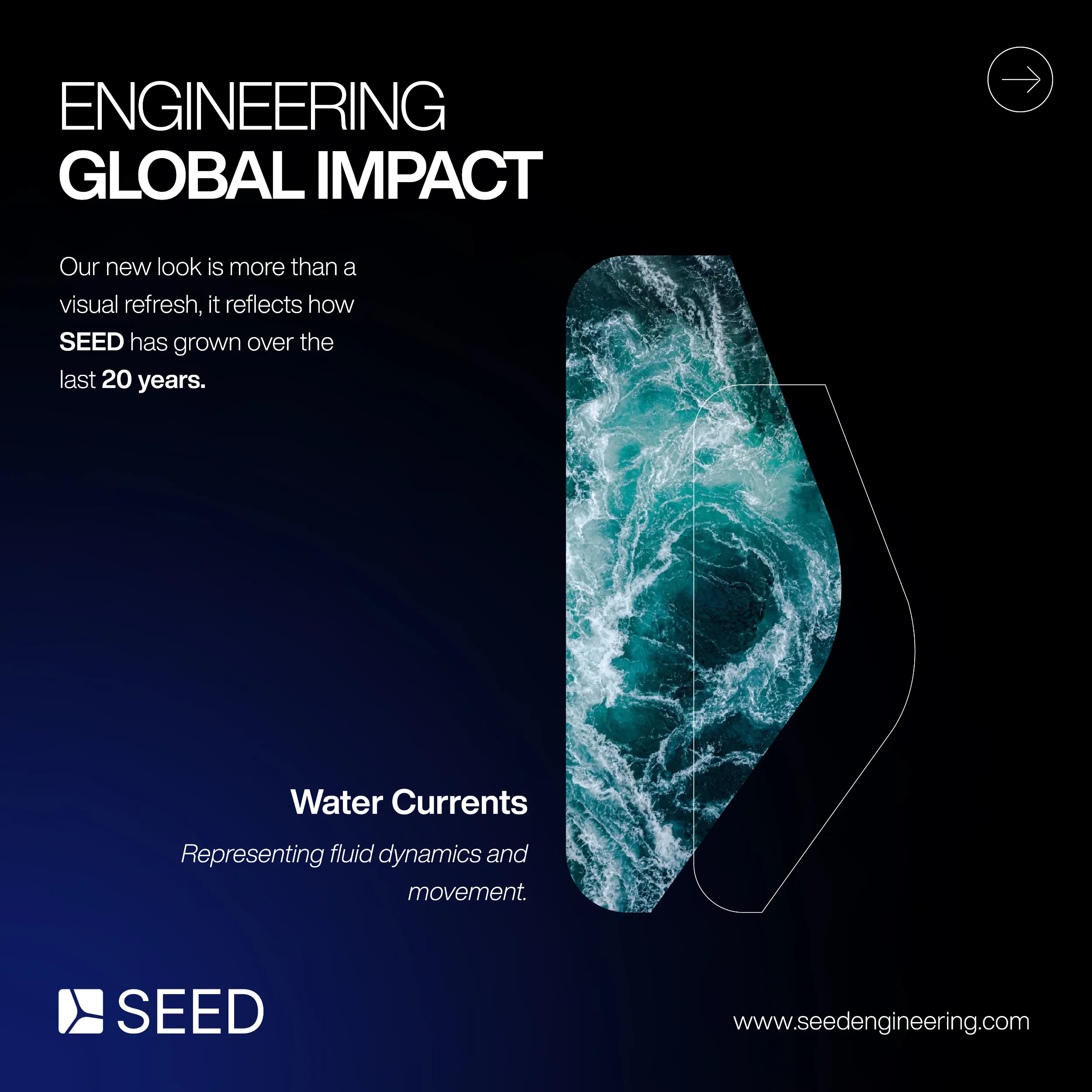
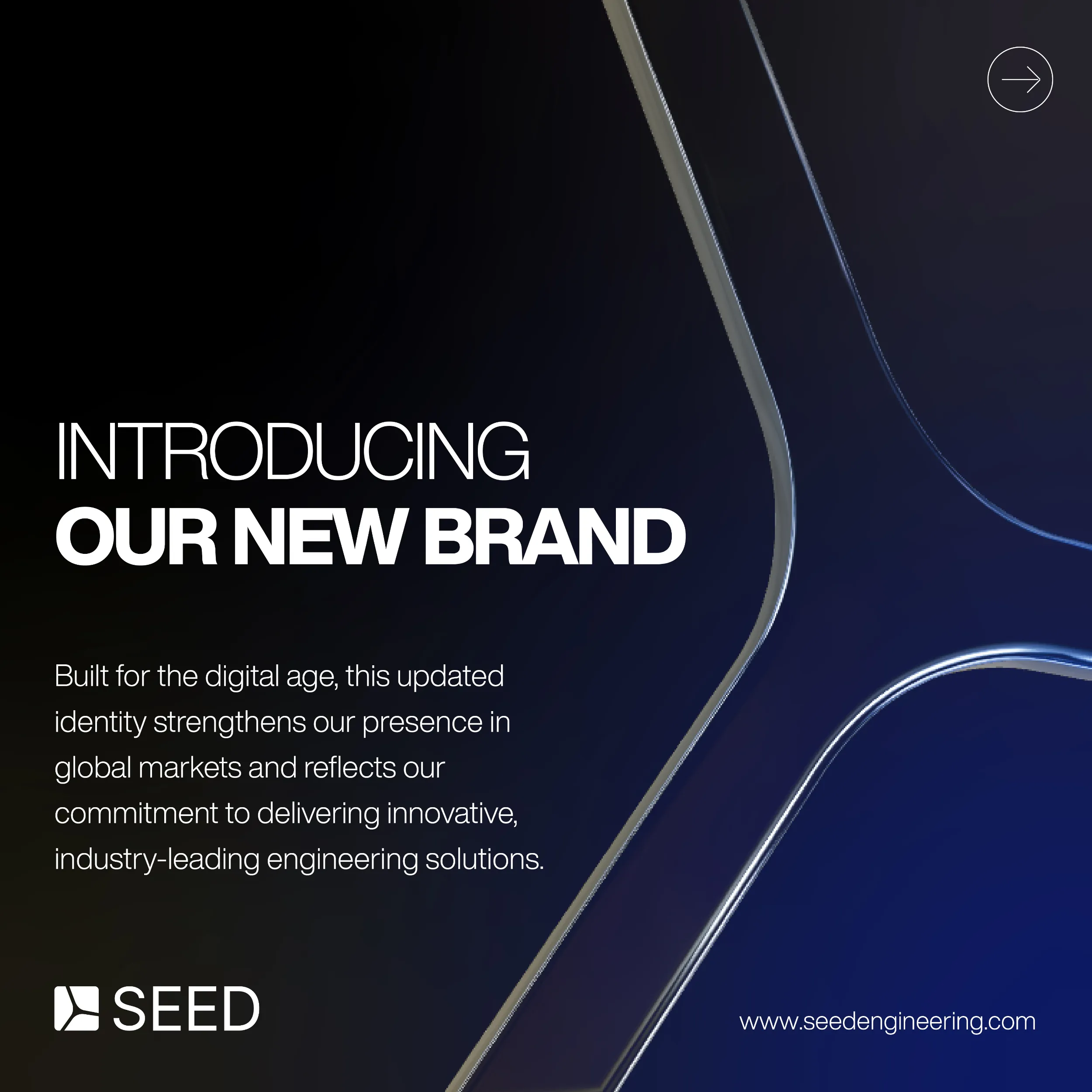
Refining Form, Retaining Meaning
This rebrand reimagines SEED Engineering’s original turbine form within a solid, architectural silhouette - balancing motion and structure to reflect SEED’s technical precision and built-environment expertise. Our approach focused on preserving brand equity while creating a cleaner, more consistent identity for digital and physical use.
We studied the existing assets, drawing out recognisable elements to evolve, not replace. The softened corners and bold geometry enhance visibility, while the form subtly nods to rotation — a reference to SEED’s sustainability roots. The result grounds the brand in its sector and signals a confident, modern identity built on innovation, adaptability, and purpose.

.png)

.webp)
%20(3).webp)


